(process)
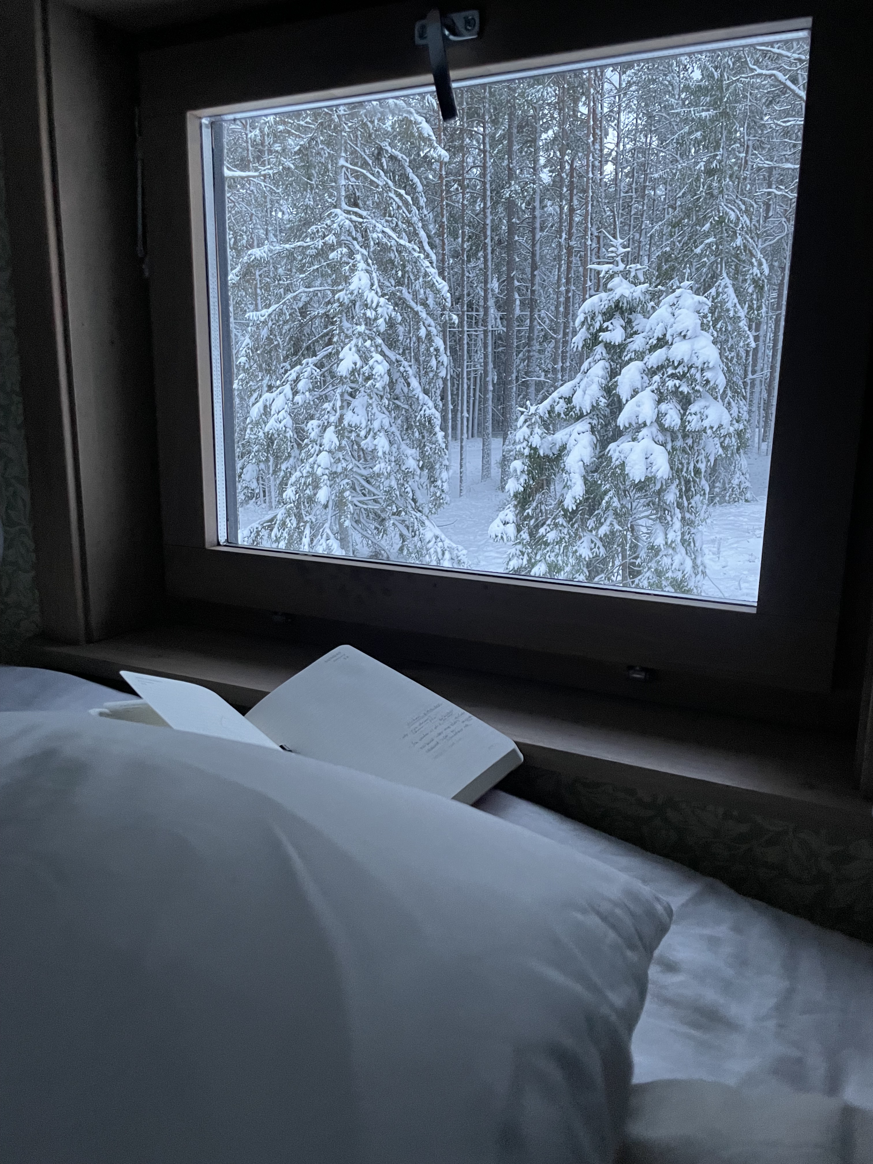
Central Asia, a while ago. My friend during morning prayer, with her coffee cup on the window pane.

January. The bright, white cold. Minty enough that I feel it in my teeth. I sleep on my loft, right under the angle of the beams, where the heat has risen to.
Climbing down the ladder feels like dipping your feet in ice cold water. Like a summer lake that’s only warm on the surface. I stand up straight and stretch my hands back up and feel it in my fingers, the heat that’s risen and left the floor boards cold.
I’ve been enjoying running. When I come home I’m overheating and warm to the bones, and I can sit out on the porch as I cool down. I get about ten minutes to look at the stars before I start shivering.
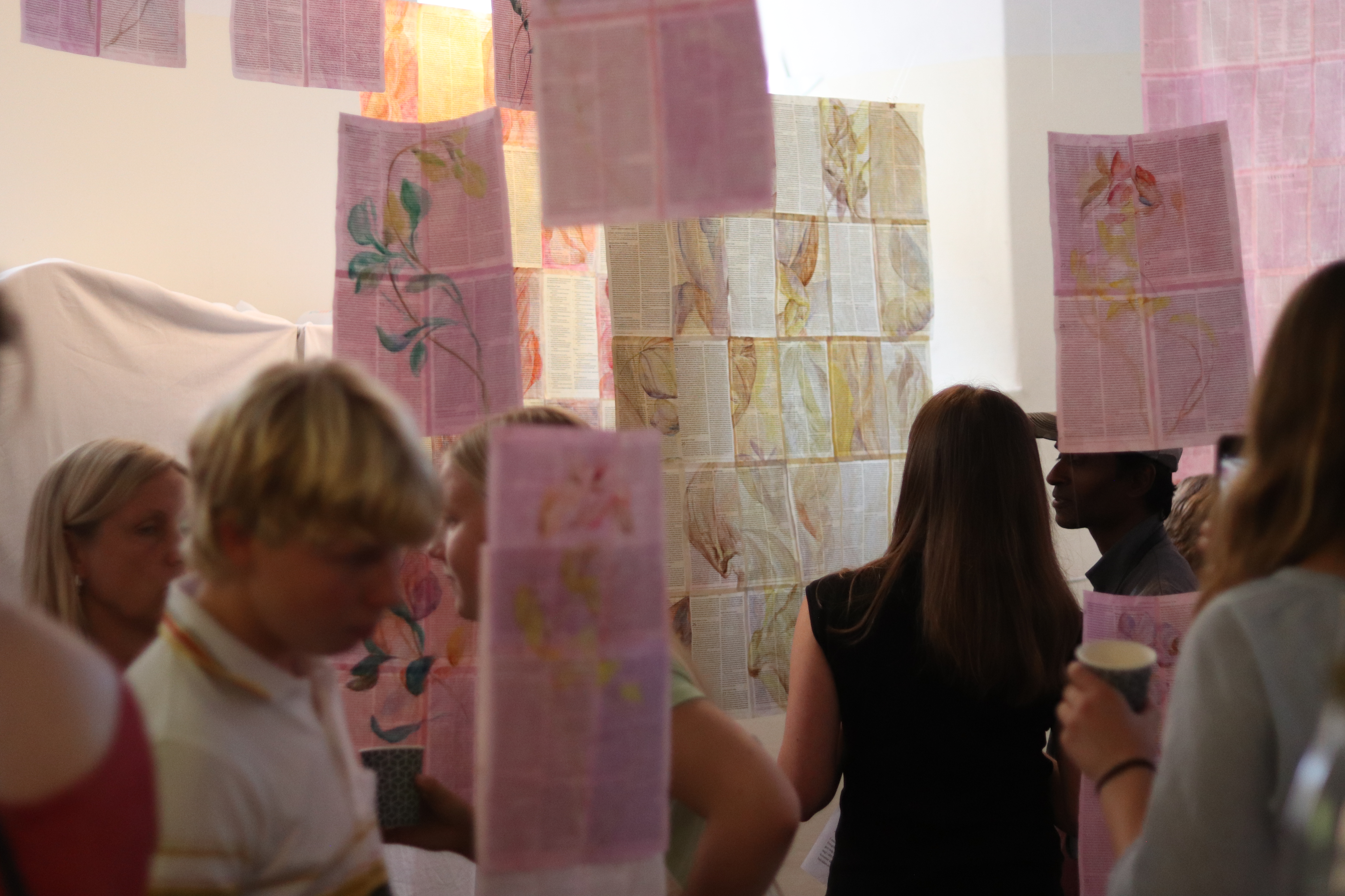
I spent some days out on the streets of Stockholm this fall, photographing people and asking them questions. It turned into an exhibition. Me and my friend hung our art in a bookstore in the city, run by people we know. I never really wrote about it here, so well. Now I am.


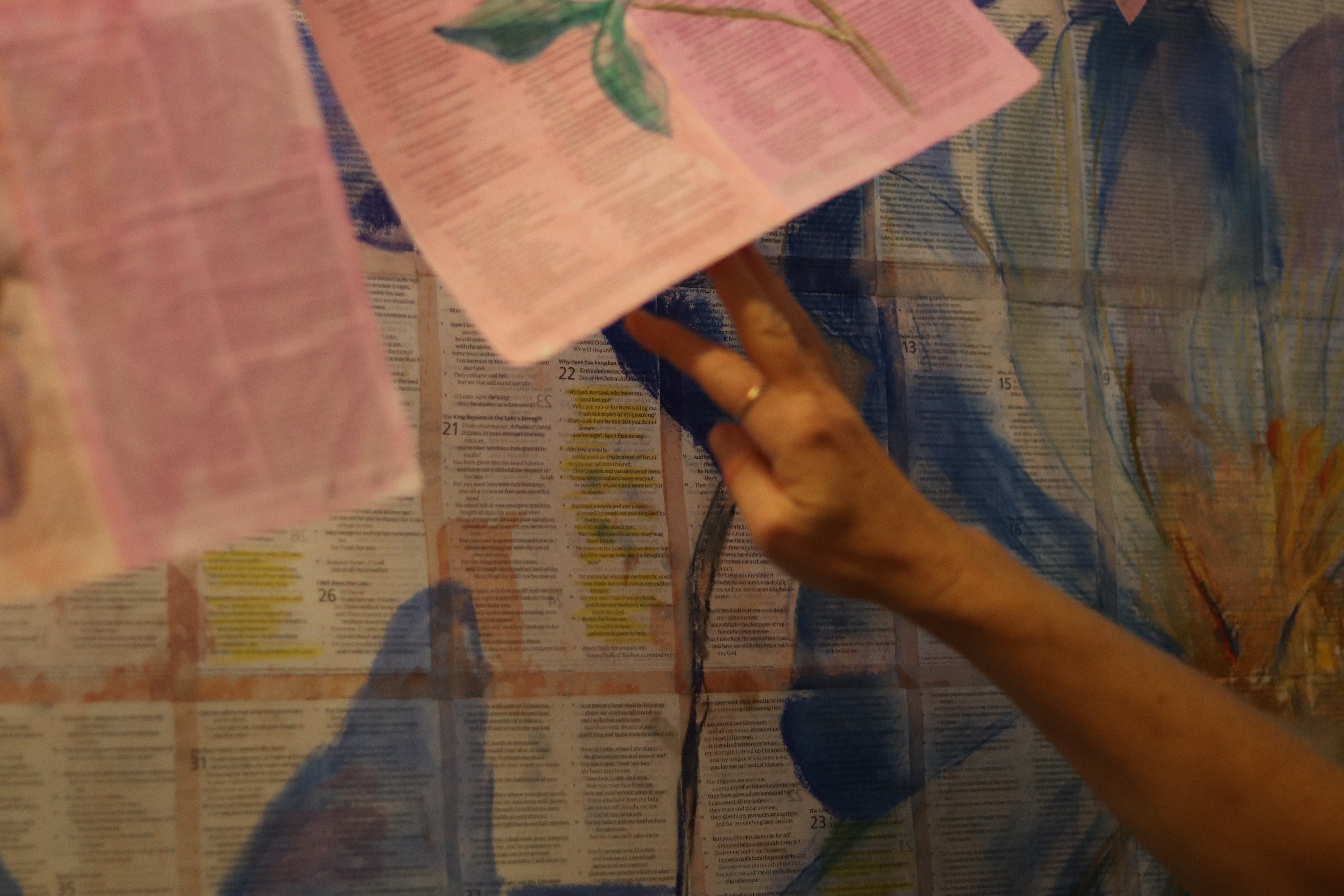
When I say that it turned into an exhibition, it’s not quite true. We had an exhibition date set quite early, and I had no art. I had to make something. And I didn’t want to bring a random collection of my paintings, without any coherent theme. So I made something in response to the art my friend was going to show.
She’d been painting florals on taped together bible pages. On the theme of what’s brittle, and what’s eternal. Inspired by the book of Isaiah:
“A voice says, “Cry out.”
And I said, “What shall I cry?”
“All people are like grass,
and all their faithfulness is like the flowers of the field..”
It’s about what’s futile, but also about what’s important. So I thought, what words matter? Out of all the things we say, what lasts? I photographed people on the street and asked them:
“What’s the most important thing you’ve ever said?”
Here are a couple of answers.

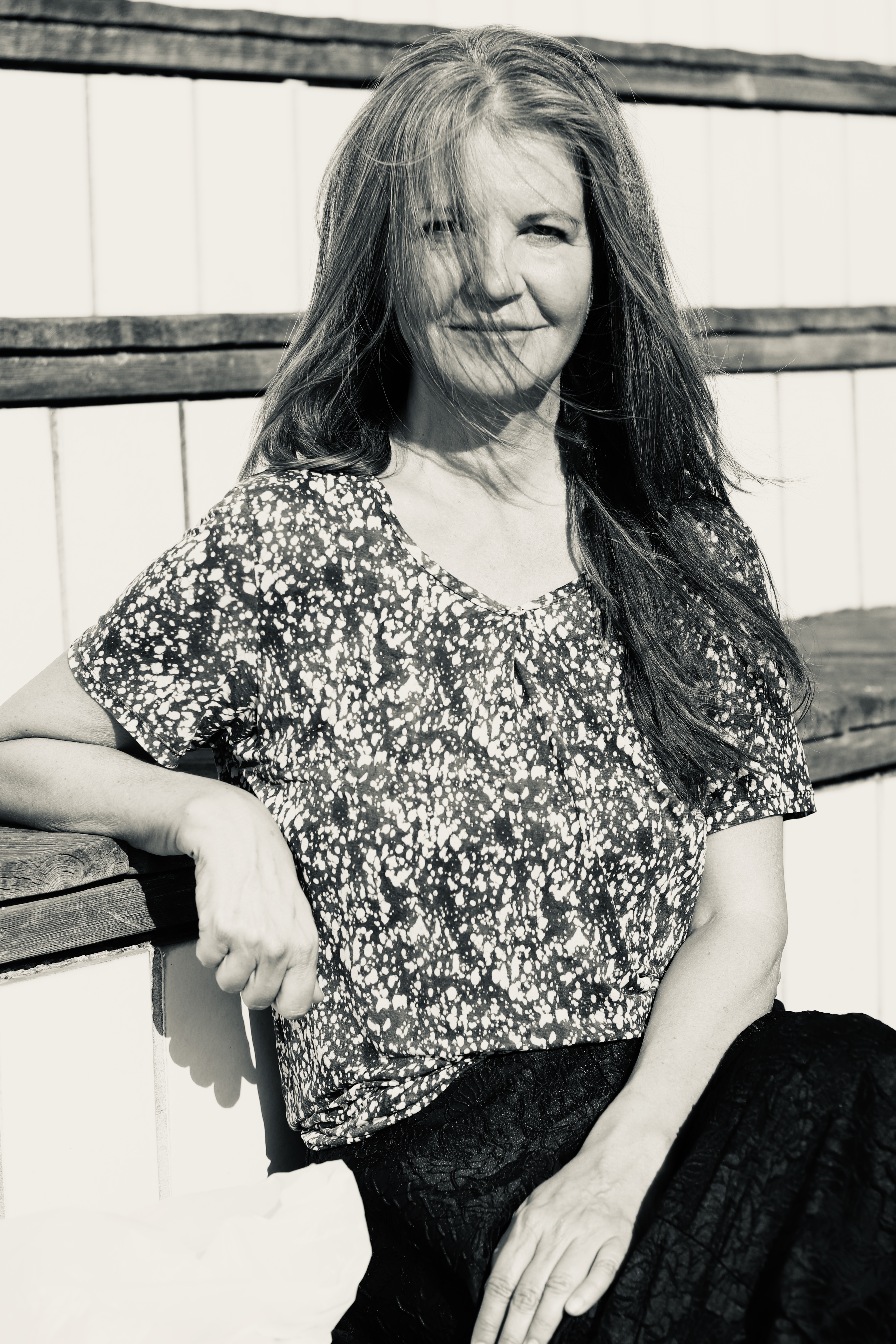
”I love you. When I say it to my wife and my kids. It’s not so often that I say it. I’m trying to think when was the first time… probably when she was my wife to be. When I knew that it was her. With the kids it’s different, I probably haven’t said it as often.”
The more he talked, the more he seemed to get into a bit of a crisis about whether he actually had said I love you to his kids. It was a bit funny. Maybe he went home and told them. He was great to talk to, and so good to photograph, look at that side profile.
“Get lost.”
This woman knew exactly what she was going to answer. Usually people are a bit overwhelmed, the most important thing you’ve ever said, it’s a big question. But not this woman. She was nodding and had an answer ready before I even finished talking. “Get lost. That’s the most important thing,” she said.
I asked something more about it, what made her say it. She said that it was to someone who made her life miserable. That it was survival instinct. She spoke about it very bluntly, in short, confident sentences. There’s something in her posture too, I think. You can see that she knew her answer. Back straight.

I wrote everyone’s answer on the back of their portraits, and hung them in the middle of the room, so that people could walk around and read.
(And now you’ve seen some of it, so you’ve basically been to our exhibition, virtually, yey!)
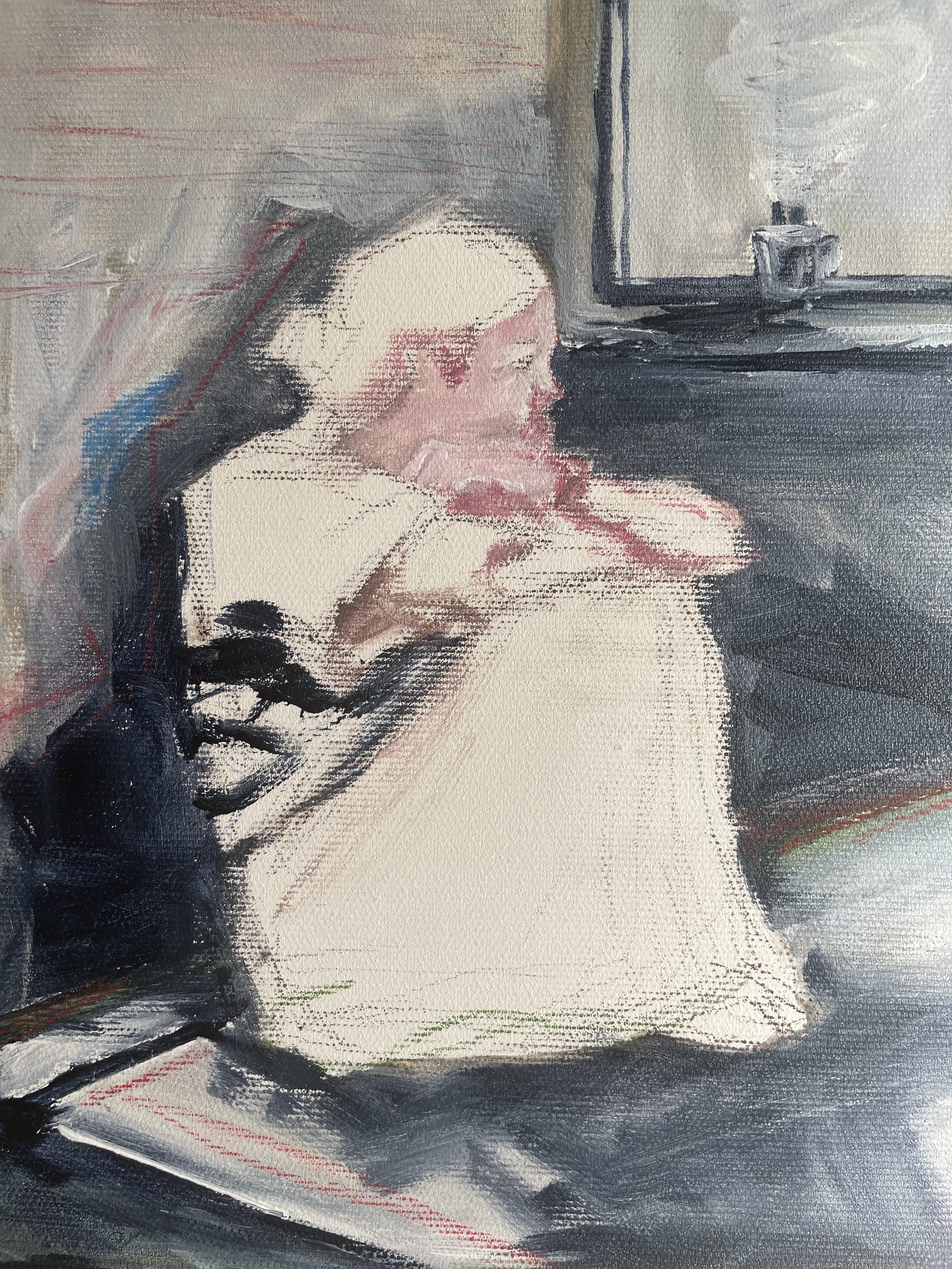
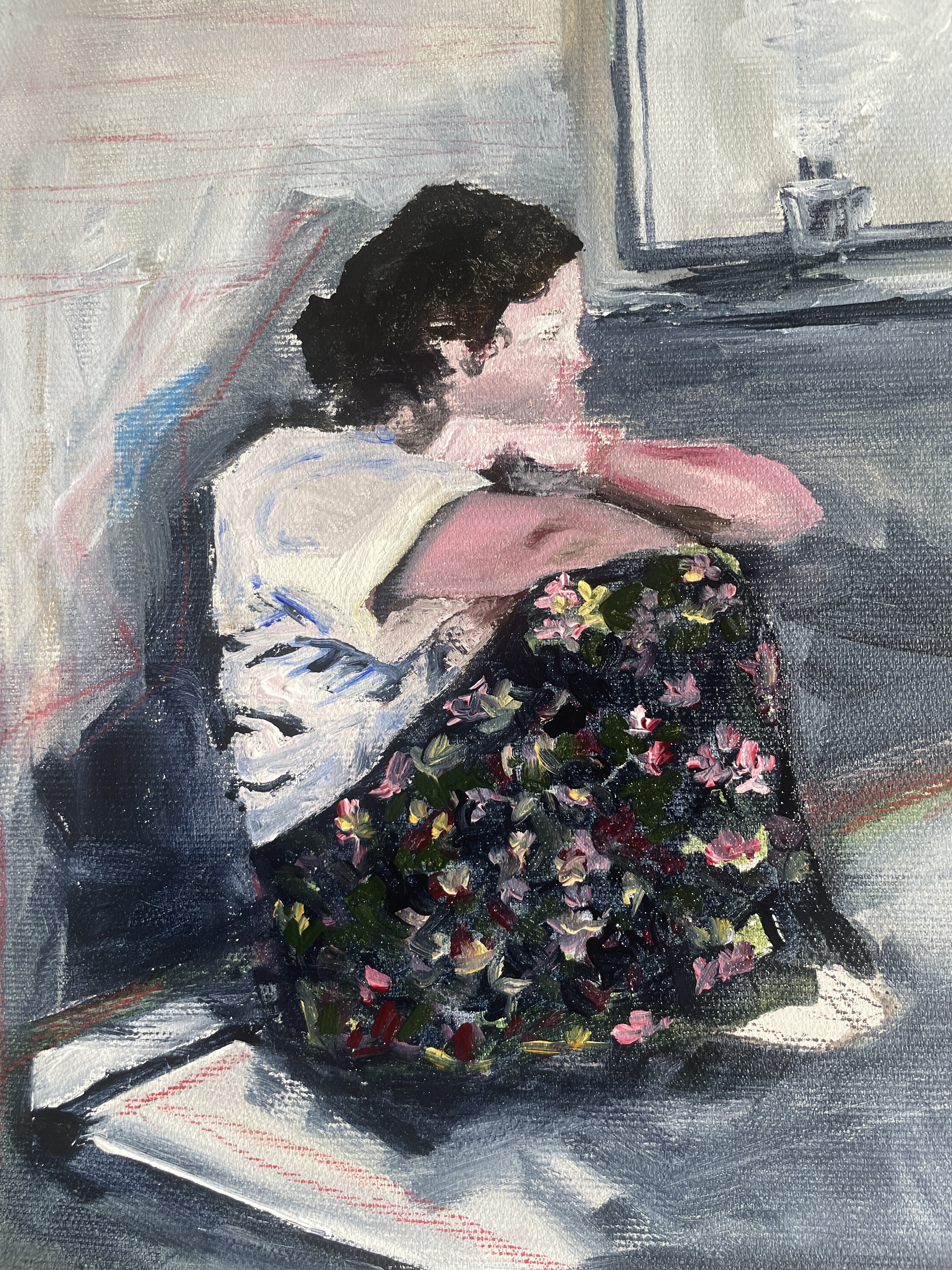
A painting of my friends, in a cafe, quite a long time ago now. Talking under the skies.

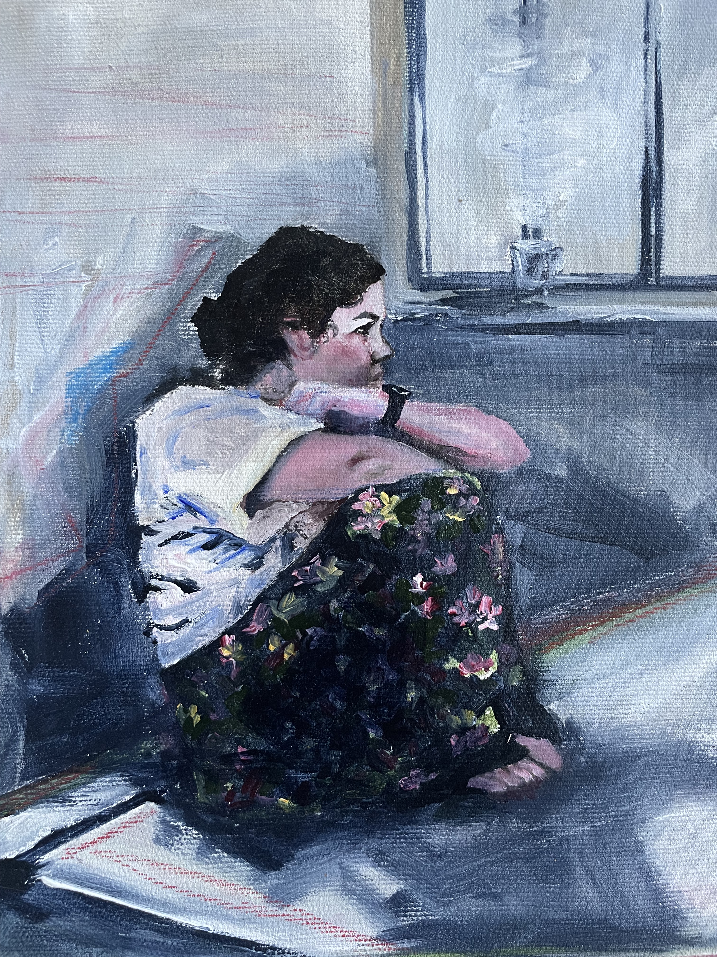
Late night acrylic painting.

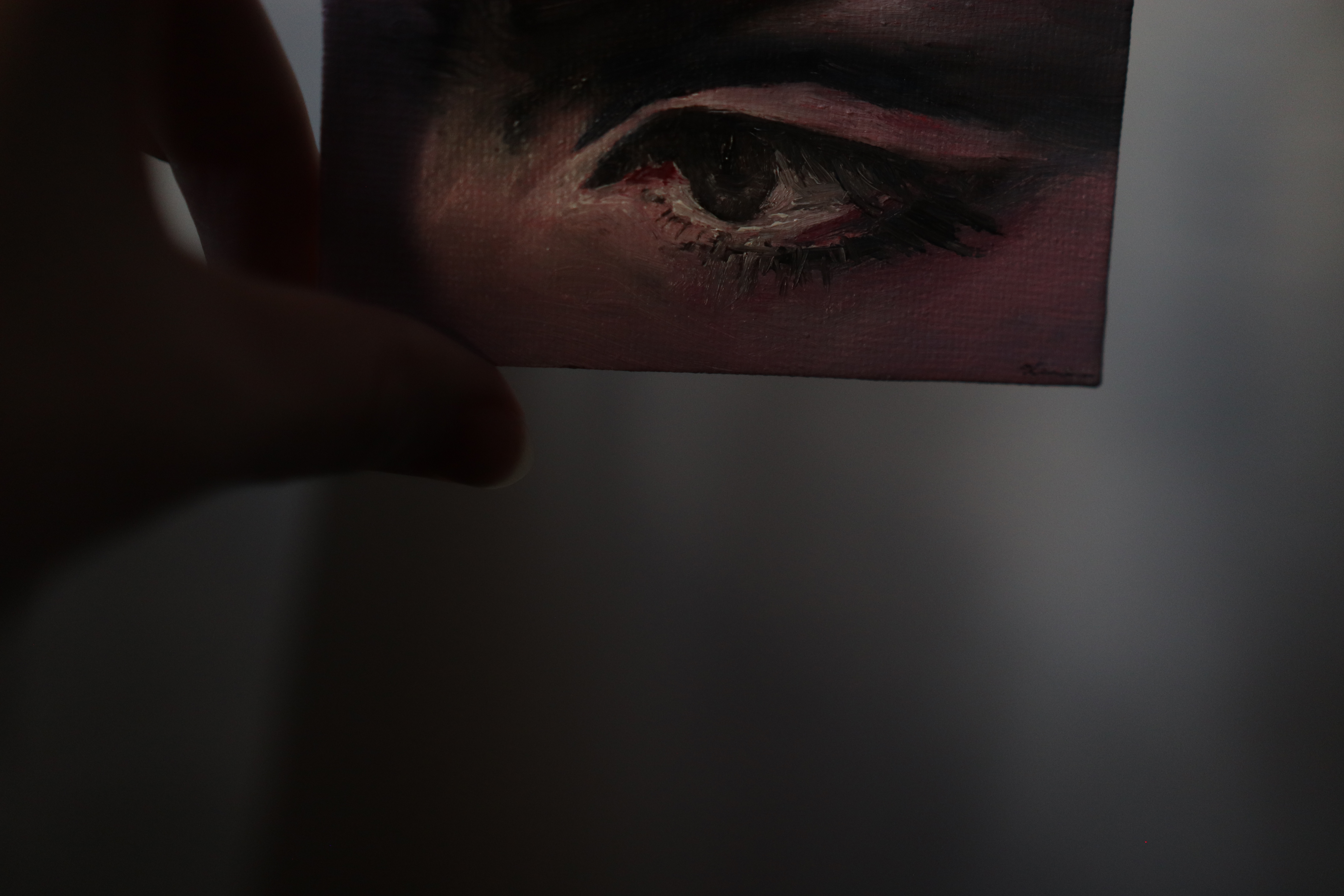
Tiny little oil painting.

(Late, late, a summary of this year’s (oops, last year’s) inktober!!!)
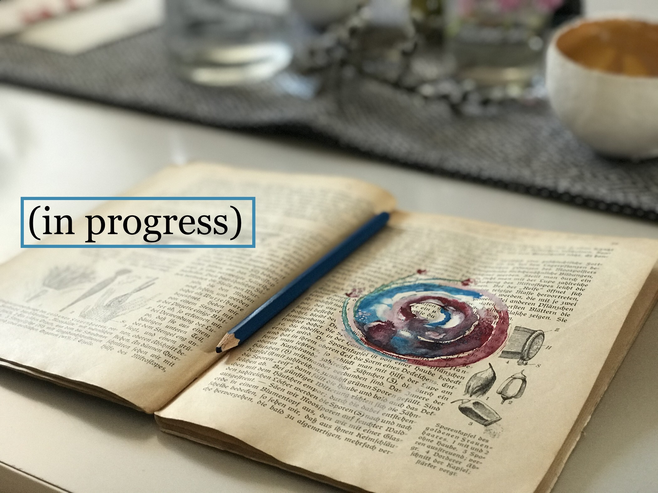
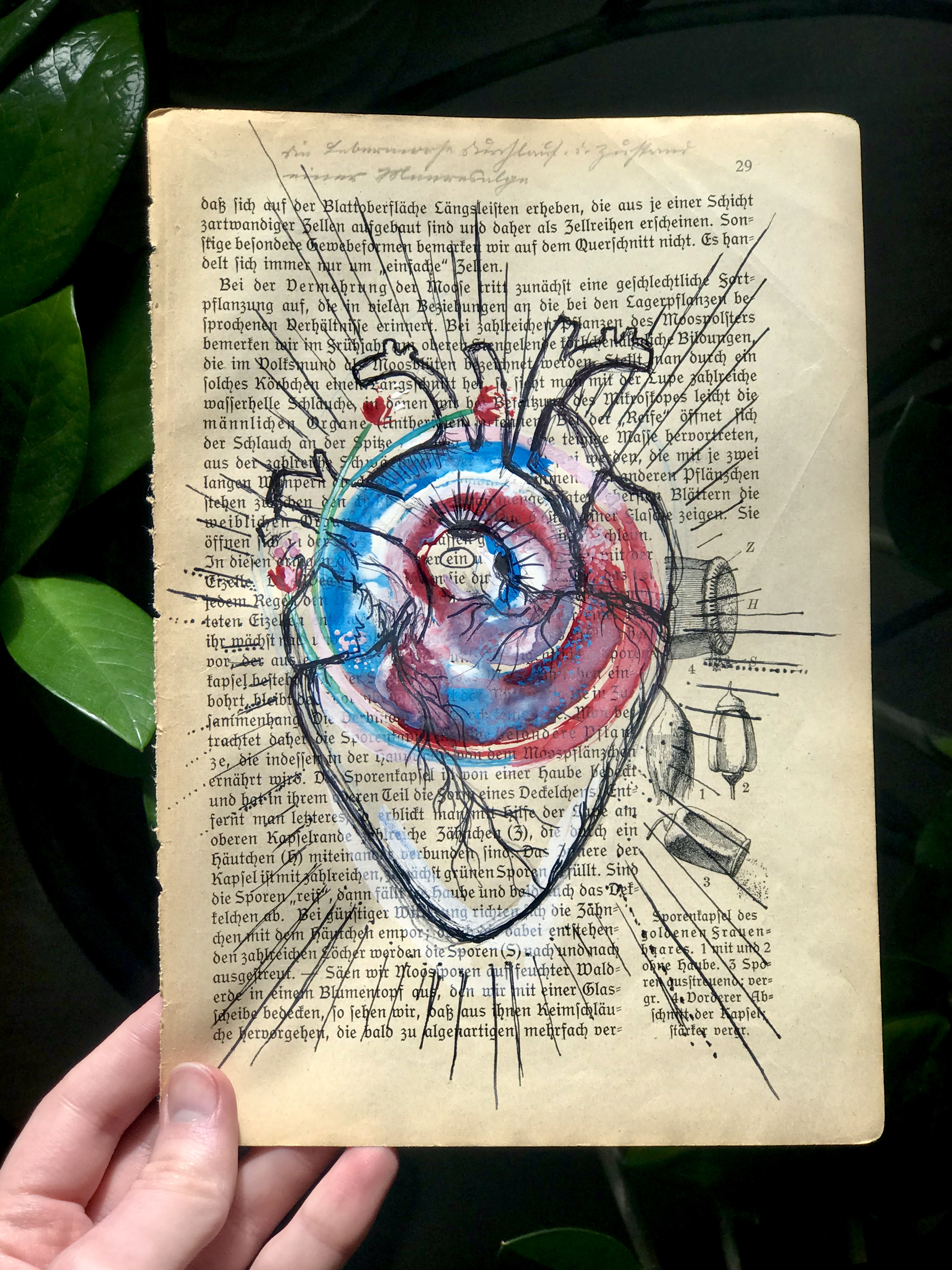
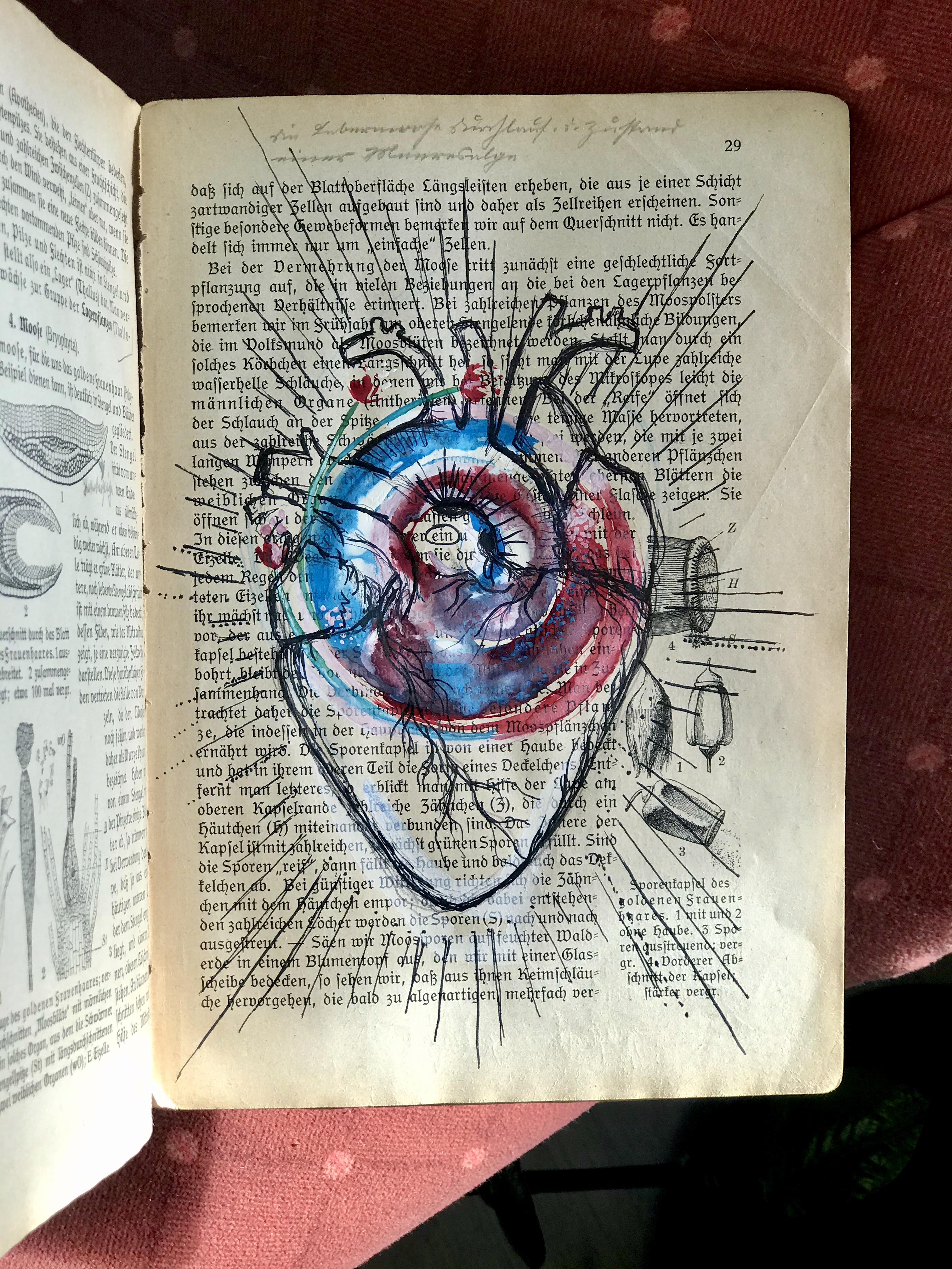
This is the first in a series of paintings that I’ve made on book paper. The book is one that I bought second hand in Germany, and it’s about plants and natural remedies (well, as far as I can understand).
This painting is “ein Herz”, a heart, with small flowers growing out of it and the word “ein” in the middle, for wholeheartedness.

~ Get a page for you or someone else, carry with you a part of the bigger story ~
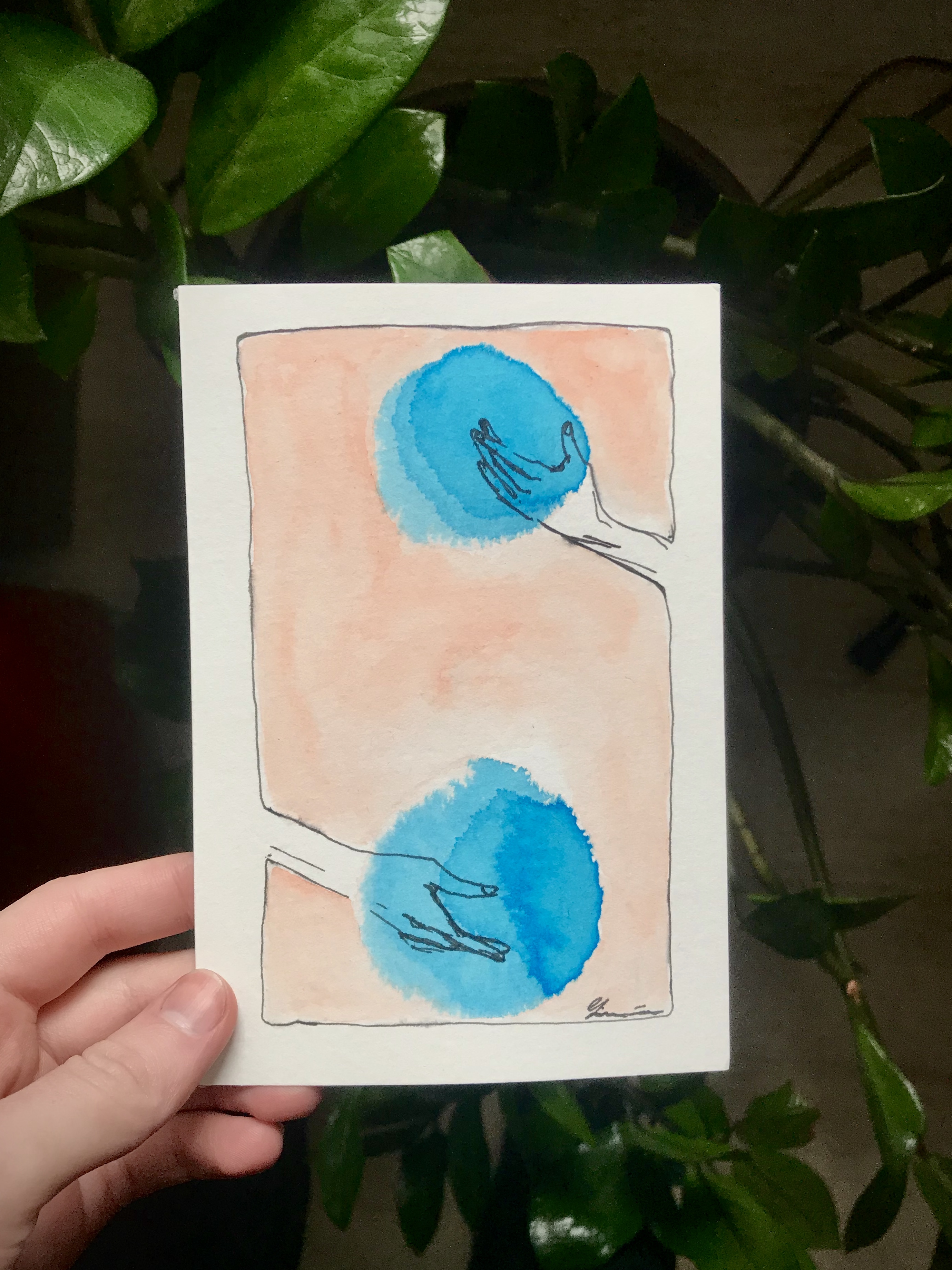
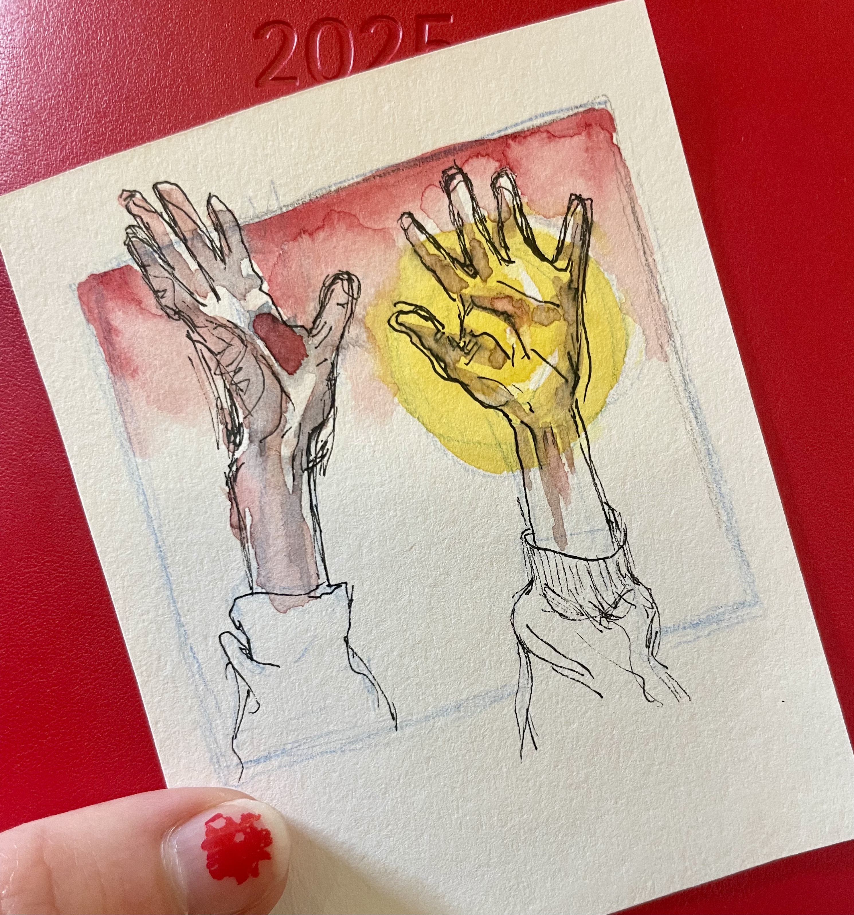
The latest evolution of my art style is more abstract watercolous. There’s something freeing about the way water flows. And something annoying in how you need to wait for each layer to dry to be able to add any more dimension. But it’s good for soul and spirit, there’s freedom in this.